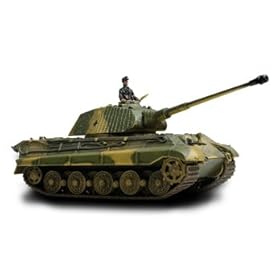
 Color is an important aspect of design. It can easily highlight an object as well as hide it. As with a majority of all military related gear and equipment, color is used in an effort to hide these particular items or people with its current surroundings. Generally, specific colors are placed in patterns so as to illusion the eye into blending the patterns with its surroundings. Even for something as massive as a military tank, color and pattern are used to this purpose. However, a simple change in color could entirely change how one views such a deadly machine. Below is an image of a tank done in an array of bright colors. While the materials used to color the tank may be a factor in making the tank seem less harmful, it is my belief that the rainbow of colors plays a far more important role. If the balloons were entirely black and or dark forest green, the tank would still hold some sort of treacherous quality to it. Rather, the bright colors do away with these feelings. First and foremost is the understanding that such a color scheme would never be used in wartime situations as such a tank would be easily spotted and destroyed. Secondly, the bright colors often have associations to them that a person can relate to. Warm colors such as red, orange, and yellow are often correlated to that of the sun, summer and sunshine, while the light green and blues relate to spring and fresh air. What color is able to do is evoke powerful relations between seasons, events and images that simple black and white may not be able to do. In this particular case, I am reminded of rainbows and birthday parties, a far cry from the perils of war.
Monday, November 29, 2010
Color Transforms
 Color is an important aspect of design. It can easily highlight an object as well as hide it. As with a majority of all military related gear and equipment, color is used in an effort to hide these particular items or people with its current surroundings. Generally, specific colors are placed in patterns so as to illusion the eye into blending the patterns with its surroundings. Even for something as massive as a military tank, color and pattern are used to this purpose. However, a simple change in color could entirely change how one views such a deadly machine. Below is an image of a tank done in an array of bright colors. While the materials used to color the tank may be a factor in making the tank seem less harmful, it is my belief that the rainbow of colors plays a far more important role. If the balloons were entirely black and or dark forest green, the tank would still hold some sort of treacherous quality to it. Rather, the bright colors do away with these feelings. First and foremost is the understanding that such a color scheme would never be used in wartime situations as such a tank would be easily spotted and destroyed. Secondly, the bright colors often have associations to them that a person can relate to. Warm colors such as red, orange, and yellow are often correlated to that of the sun, summer and sunshine, while the light green and blues relate to spring and fresh air. What color is able to do is evoke powerful relations between seasons, events and images that simple black and white may not be able to do. In this particular case, I am reminded of rainbows and birthday parties, a far cry from the perils of war.
Subscribe to:
Post Comments (Atom)

No comments:
Post a Comment