In these current times, it is important to understand that design needs to be carefully thought out and meaningful. Literally millions of items are being produced everyday and easily more than half are physical items that may or may not be useful to society. Today I want to highlight not only the need for usable objects, but the importance of the production required when forming the object. In order to maintain steady production, CO2 is often admitted into the atmosphere. Data posted by the Union of Concerned Scientists in reference to global warning showed that the United States alone was responsible for 5833 million metric tons of CO2 being released in the year 2008. This puts the US as the 2nd highest country in terms of CO2 emissions. Product manufacture, while it is not the sole input to these statistics, still contributes to this issue.
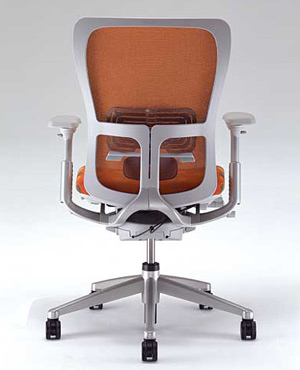
Attempted to rectify some of this problem, US furniture systems manufacturer Haworth announced that it's Zody task chair had earned "Planet Positive" certification. For several years, the production of the Zody had been examined with the aim of reducing and managing its CO2 emissions as well as the company's other products. In addition to this, after reducing CO2 emissions as much as practical, clients were to purchase vouchers for 110 percent of the remaining embedded CO2. These certificates were then passed on to product buyer so that the end user could invest in a carbon offset project of their own choosing. The Zody, as seen on the left, may seem like a typical chair, but the though and ingenuity put forth in its creation is highly worth while. By releasing fewer CO2 emissions, global warming is being actively fought. It is hopeful that such practices for future design be spread further amongst the world as it is highly beneficial to the present and future.
Verbalize Design
Monday, November 29, 2010
Design is Dangerous
Recently, I have had this misfortune of housing two mice within my apartment. It was then that I became familiar with a small object that I think is poorly designed, and potentially highly dangerous for its users. What I am in fact discussing today is the standard mouse trap. While the function of the basic trap is easy to understand, the mere process of setting the trap can be detrimental to ones' fingers. Mouse traps run on a basic spring action. A metal bar is pulled taut against one end of the trap and held down with another slim metal bar. This bar is then loosely secured to a small lever in which the bait is placed. When a mouse or other animal comes to partake in said bait, the lever mechanism will release the hold bar and the spring action will force the other bar swiftly upon the victim and crush its body. While this may be effective in catching a mouse, the lever securing the bar from snapping is easily activated and often times can snap forward while a person is setting the trap, therefore injuring their own fingers. I was lucky to avoid this misfortune, but only narrowly. To further its dangerous qualities, this trap, once placed, has nothing to prevent other people of animals from setting them off. They are highly inappropriate in places where small pets and children can be found as one of them could easily encounter these devices.
In addition, the basic mousetrap is horrible in terms of clean up and hygiene. A caught mouse is literally crushed, spilling who knows what kind of germs and bacteria onto the surface in which it has died. In some cases, if a person was unable to check the traps daily, a caught mouse will begin to fester and generally tend to stick to the ground in which it is laying. The spread of bacteria is frightening. Thankfully, there are several improvements on the mousetrap today in which a caught mouse is housed within a bit of plastic. These newer traps are then exposed of entirely keeping the area in which the mouse died somewhat cleaner than that of the old mousetraps. This is definitely an improvement, but with luck, one will never even need to use any types of traps for these unwanted critters.
Color Transforms
 Color is an important aspect of design. It can easily highlight an object as well as hide it. As with a majority of all military related gear and equipment, color is used in an effort to hide these particular items or people with its current surroundings. Generally, specific colors are placed in patterns so as to illusion the eye into blending the patterns with its surroundings. Even for something as massive as a military tank, color and pattern are used to this purpose. However, a simple change in color could entirely change how one views such a deadly machine. Below is an image of a tank done in an array of bright colors. While the materials used to color the tank may be a factor in making the tank seem less harmful, it is my belief that the rainbow of colors plays a far more important role. If the balloons were entirely black and or dark forest green, the tank would still hold some sort of treacherous quality to it. Rather, the bright colors do away with these feelings. First and foremost is the understanding that such a color scheme would never be used in wartime situations as such a tank would be easily spotted and destroyed. Secondly, the bright colors often have associations to them that a person can relate to. Warm colors such as red, orange, and yellow are often correlated to that of the sun, summer and sunshine, while the light green and blues relate to spring and fresh air. What color is able to do is evoke powerful relations between seasons, events and images that simple black and white may not be able to do. In this particular case, I am reminded of rainbows and birthday parties, a far cry from the perils of war.
Monday, November 15, 2010
Simply unforgettable
All brand names are well known. That is why they are brand names. When one thinks of Louis Vuitton, Gucci, or BMW, one thinks of the merchandise in which they market. Another person will envision the logo that represents these products. Taking the Louis Vuitton logo, for example, it is comprised solely of the uppercase letter L juxtaposed with the upper case letter V. As separate pieces, they would only be letters of the alphabet, but when combined in this particular manner with the V overlapping a portion of the L, it becomes an internationally recognized symbol. But what is it that makes this logo, as well as many others, so unforgettable?
In this particular case, it is a combination of simplistic design, and its ability to convey information.
This logo, or logotype, is comprised of two singular components; two letters, aesthetically placed form the logo for Louis Vuitton. The significance of the two letters, the L for Louis and V for Vuitton, are easily identifiable as the initials for this brand. The correlation between the initials and its usage in the logo is understandable. Were the brand to suddenly incorporate another letter, the correlation would not be as clear and the probability of the "new" logo being just as successful is low. From this particular example, it can then be surmised that a successful logo has to make sense in relation to what it is representing. This may or may not be the case in terms of all logos, considering the Carl's Jr. logo is a five pointed star, but it is definitely something to keep in mind. As for the LV logotype, the message is clear, it is simple, and elegantly design... much like its many products... wouldn't you agree?
Stuck on Design
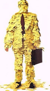
As I was closing up at work for the night, I realized that an issue that had arisen today could possibly lead to similar issues tomorrow. To avoid further problems, I hastily scribbled a note for my fellow coworkers to read the next morning so they would not be caught unawares. Fearing the note would fall prey to unstoppable forces like a gust of wind or accidentally be regarded as trash, I was then forced to acquire some adhesive to secure the note and ensure that neither of these circumstances would occur. It was then that I wished wholeheartedly for a pad of post-it notes. The post-it note, most commonly a 3 x 3 inch square pad of canary yellow paper, can almost always be found on a persons desk, within a school bag, or randomly tacked to any surface whatsoever. But what is it that makes the post-it note so popular?
 The post-it note, most commonly a 3 x 3 inch square pad of canary yellow paper, can almost always be found on a persons desk, within a school bag, or randomly tacked to any surface whatsoever. But what is it that makes the post-it note so popular?
 Is it safe to use?
The post-it note is extremely safe to use. They are lightweight pads of paper. If one were to fall upon your foot, the only injury done to your person would be a bout of annoyance. Outside of the occasional paper cut, these precut little squares don't hold much of a threat.
Are they comfortable?
Generally, the standard post-it pad is 3x3 inches in size. This is a particularly ergonomic design as it fits easily into the human hand. When in hand, a post-it pad can be comfortably gripped along three of its four sides without causing any undue stress. As stated earlier, it is lightweight and easily portable so lifting the item would not be considered strenuous activity.
Is it easy to use?
This simple little pad of paper is surprisingly easy to use. One simply has to write upon it, lift the edge of the top sheet, peel the note off the stack and post it wherever he or she desires. The only complication I have ever come across when using this item is not knowing which side of the pad is the top (the top being the portion of the pad with adhesive on the underside). There have been several times when I have written a note and discovered that said note, when pulled away to be posted, is upside down. Still, this is a lapse in the person's use of the product, and not so much the product itself. However, if the top of the post-it or the adhesive edge were to be a different color or printed with a small mark signifying its usable orientation, this problem could be solved.
How does the Post-it rank in terms of performance?
It is absolutely genius. The post it note can be used anywhere and for multiple reasons. These sticky little squares enable a person to make notes and post them on or beside almost any surface. The typical 3x3 size forces a person to be straightforward and to the point with the note or message as limited writing space is available. However, what makes the post it so amazing is the low tack adhesive on the backside of each note. The low tack enables the note to stick upon most surfaces, but allows for it to be easily removed. This temporary adhesive is a quick fix to paper and tape, and leaves no residue behind. It is quick, clean, and convenient. It's small size allows for easy storage, and light weight for easy travel. The post-it can go anywhere with its user.
Is it aesthetically pleasing?
As simple as it is, I find the post-it note to be very pleasing to look at. The post-it note typically comes in a soft canary yellow color. This color, while being vibrant enough to catch the eye, is not so saturated or bright that it strains ones ocular nerves. Even with its new expanse of colors, the post it note is small enough in size that even its fluorescent pads cannot be considered an eyesore. In fact, some of the newer post-its and their vibrant colors have been found today as the base materials in beautiful works of art. What can I say? Some designs come and go, but as for the post-it note... well, they just stick.
Monday, November 8, 2010
the Vocalized word
This week, I was assigned to write about how word and image interacted with each other. For some unknown reason, I concentrated solely on the written word in conjunction with the image. After sitting down to browse through some of my favorite web-links, I came across an old one for a favorite commercial of mine. As I reviewed this commercial, I was struck by how effective the words in conjunction to the images were and realized that words and images interact in all forms and are not restricted to two-dimensional designs. In this particular commercial, the advertised subject matter is displayed with few screen adjustments. For a full minute, the viewer is shown an almost unchanging image of two McDonald's filet-o-fish sandwiches. A majority of the commercial depicts the two sandwiches placed side by side upon a table. There are a few close ups of a singular sandwich, but for the most part, all the viewer sees is an image of the dual sandwiches.
Both sandwiches are then humanized and given the ability to speak. Their conversation is not very enlightening. Rather, it is highly repetitive. Despite this repetitive speech, it is incredibly amusing to listen to. The visual image presented to the viewer is not very interesting, but the words being spoken engages the viewer and keeps them focused on the subjects of the image. This is a prime example of how word and image become successful partners. Without the words, the image would be boring and easily overlooked. Without the image, the words would hold no true meaning and loose its engaging characteristics. Together, they become highly effective. The video below is the commercial that has inspired this post. Be warned that after watching it, you may be persuaded that a trip to McDonalds is in your near future.
Both sandwiches are then humanized and given the ability to speak. Their conversation is not very enlightening. Rather, it is highly repetitive. Despite this repetitive speech, it is incredibly amusing to listen to. The visual image presented to the viewer is not very interesting, but the words being spoken engages the viewer and keeps them focused on the subjects of the image. This is a prime example of how word and image become successful partners. Without the words, the image would be boring and easily overlooked. Without the image, the words would hold no true meaning and loose its engaging characteristics. Together, they become highly effective. The video below is the commercial that has inspired this post. Be warned that after watching it, you may be persuaded that a trip to McDonalds is in your near future.
Word + Image: A moment with Brian Fies
Several days ago in my design class, I had the honor of meeting Brian Fies, the author and illustrator of Mom's Cancer. During that class period, he spoke of the reasons for which he had written and illustrated his first book, as well as giving us tips about the design process. He showed us several slides of preliminary work, as well as the many different variations of the cover design. Although he did not show us all of the designs for the book cover, I was struck by the number of designs he was showing us while simultaneously telling us that these were not even the sum of them. I came to understand the immense amount of work put forth in that one image that was necessary to attain the best option. The first sketch is almost never the best sketch, but training oneself to search above and beyond for the best can be a tedious process. Oftentimes, it is easy to come up with an idea, and be thoroughly entrenched in that one idea that a designer fails to see that what he has envisioned may not be as well suited as the designer wishes.
Seeing Fies' slide of his book cover designs helped to give clear definition to Karl Aspelunds' Design Process. After getting inspired, identifying what it is the designer wishes to do, and coming up with a concept, his fourth step is Exploration and Refinement. For a while, I could never fully understand what a designer would need to explore, but after seeing the many renditions of Fies' book cover, I was able to see that one thought, one single image could be changed in an infinite amount of ways and still be able to be edited. It is through these edits and changes that a designer can come across his best works. The design process is still new to me, but thanks to Brian, I am one step closer to learning the basic skills I will need to survive as a designer in society.
Subscribe to:
Posts (Atom)


